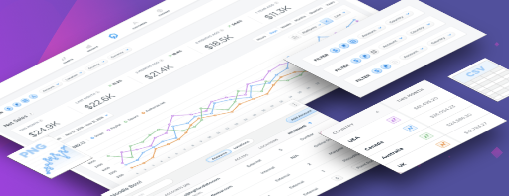
Control’s product was unique in that it was capable of normalizing the aggregate data from an unlimited number of merchants connected accounts. Control’s technology automates data reconciliation across millions of segregate merchant account- normalizing disparate data formats, timezones, and currencies in real time. Control converts these trillions of daily transactions into consolidated values that be compared and contrasted by countries, quarters, and unlimited other time/series/segments across multiple portfolios.
Aggregating Accounts
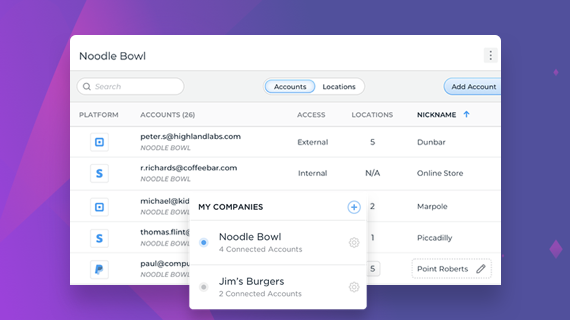
Problem
How might we allow users to aggregate provider accounts to see their complete revenue pictured, and then group them to separate sales data from different companies or regions?
Solution
To keep the mental model simple, we decided that the app’s hierarchy should be structured around the concept of companies.
A company selector was added to the global navigation, allowing the business user to switch between a logical grouping of performance one at a time.
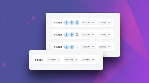
Multi-Platform Accounts
Problem
Aggregating across payment platforms created new UX challenges as the level of API support was not consistent with each payment provider. We needed to allow the user to identity where those data gaps may exist.
Solution
The existing filer bar could be updated to perform two functions. Turning the payment platform filter drop-down list into a set of logo icons would allow each user to both filter the data sources and identify which providers were supported. With three states to each button, users could easily identity if a data point was unavailable for a particular metric.
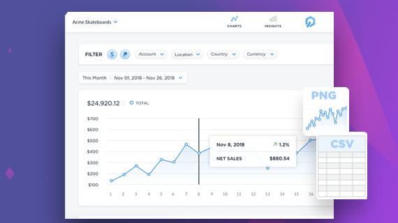
Extracting Data
Problem
Users needed to extract their aggregate, normalized data from the Control dashboard for presentation to external audiences.
Solution
To give users greater access to specific data we created a page for each metric, built around a template. Below that are the trends boxes, allowing users to quickly see how their current sales are vs previous periods. A linked data allows users consume their data in a grid format.
To help with financial we added the ability to export data tables to CSV. For sharing via presentations users could also export Control’s data visualization in SVG, PDF or PNG assets.
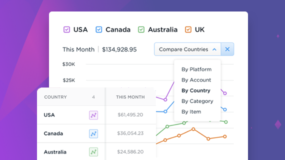
Surfacing Insights
Problem
Control’s solution took volumes of complex and disparate data and allowed business users to isolate the metrics that mattered. How could we help them track outliers, such as weak product sales across all this data?
Solution
Adding the Compare Mode to the time series chart allowed the user to select a variety of dimensions to compare allowing various X Y series. The comparison feature allowed valuable insights to be quickly surfaced.